Oslo Metropolitan University has a new logo. Here’s what the experts think.
Bold, gimmicky, and cliché are just some of the words experts used to describe the new logo.
Oslo Metropolitan University, formerly Oslo and Akershus University College (HiOA) has been searching for a new logo ever since it attained university status in January. The search is over.
From HiOA to Oslo Metropolitan University
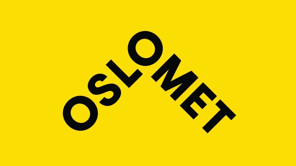
The logo, which was presented on Wednesday, has taken the yellow background from HiOA’s former image. The letters «OSLOMET» create an arrow pointing upwards in a black font.
«The logo is simple, sleek, and easy to use on many platforms, including digitally. It is shaped like an arrow and is therefore in line with the university’s role of moving society forward, providing new knowledge and professionals that there is a great demand for,» says Sverre Molandsveen, the director of external relations, in a press release.
Oslo Metropolitan University seems satisfied, but what do the real experts think?
«Different»

Dag Inge Fjeld is an assistant professor at Kristiania University College and has worked within marketing communication. He believes the logo will work well.
«It doesn’t look like anything else in the sector. There is no embellishment, and no strange fonts. This also makes ‘Met’ stand out more clearly,» he said.
Fjeld believes Oslo Metropolitan University is trying to distance itself from the University of Oslo (UiO).
«I believe they want to focus on the metropolitan aspect in their communication and make use of themes that UiO at Blindern has no desire to focus on. The coloring also contributes to this distancing. The arrow is a gimmick that I think we can live with. It is better to be spirited than to try and fit into the academic tradition.»
Final grade: B
Controversy: «It’s remarkable that Curt Rice doesn’t know English»
«The communications division has run wild»

Karl Fredrik Tangen, a colleague at Kristiania University College, believes Oslo Metropolitan University is trying to be modern. He doesn’t think they are succeeding.
«It is clever for them to distance themselves from UiO, but the arrow is just silly. It expresses a lack of respect for the tradition that will be carried on. I think that have a communications division that has run wild,» he said.
Tangen also believes Oslo Metropolitan University has forgotten it must also represent fields with long traditions, such as nursing, teaching and engineering.
«The idea of looking forward is a bit 1960s. It is modernity. It is human bravado. An arrow that is pointing upwards is about as cliché as holding a motivational speech and using an image of a mountain.»
Still, Tangen sees some good qualities about the logo. He points out it is easily recognizable and works well on both digital platforms and large surfaces.
«As a standalone logo, it works well, but as Oslo Metropolitan University’s logo, it doesn’t fit.»
Final grade: C
«Future-oriented»

Not everyone is as cynical towards the logo. Helle Gundersen has 18 years of experience in the marketing branch and is now employed at Westerdals.
«The logo is modern, which is also good, as it gives associations to new, future-oriented knowledge and research,» she said.
Gundersen sees associations to cornerstones, or a roof over one’s head.
«It is nice that the logo’s color scheme is not conservative, as Oslo Metropolitan University has many subjects with a humanistic and social image.»
Final grade: C


