Here’s the price tag for Oslo Metropolitan University’s new logo
Oslo Metropolitan University has spent nearly 2 million NOK on their new visual profile.
Obtaining university status is costly, as Oslo Metropolitan University has witnessed firsthand. Sources show the young university has spent almost 1 million NOK on changing its name, and obtaining a logo has cost even more.
Focus groups and workshops
Sverre Molandsveen, Communications Director at Oslo Metropolitan University, informed Universitas that the cost of developing the university’s new visual profile came to just under 1.5 million NOK. That breaks down to 850,000 NOK to the design agency Uniform for the development of the logo itself and visual profile, and just over 500,000 NOK toward activities for support and involvement in the form of focus groups and workshops with students and employees.
An additional 5 million kroner will be used on replacing signs around the campus. The total budget is currently set at 15 million NOK, which includes developing a profile for, implementing, launching and marketing the new university. They can’t, however, answer how many hours will be spent in total for completion of the project.

Ambivalent opinions
Agnes Backer (20), a nursing student, was among the focus group participants involved in the process of developing the university’s visual profile.
«I think the new logo is nice. It is modern and dynamic and can be used in many different contexts,» she said.
Although initially refraining from guessing how much the visual profile cost, Backer believed it should have been possible to reduce the cost once she was informed of the price tag.
«There is probably a lot else you could spend some of that money on,» she noted.
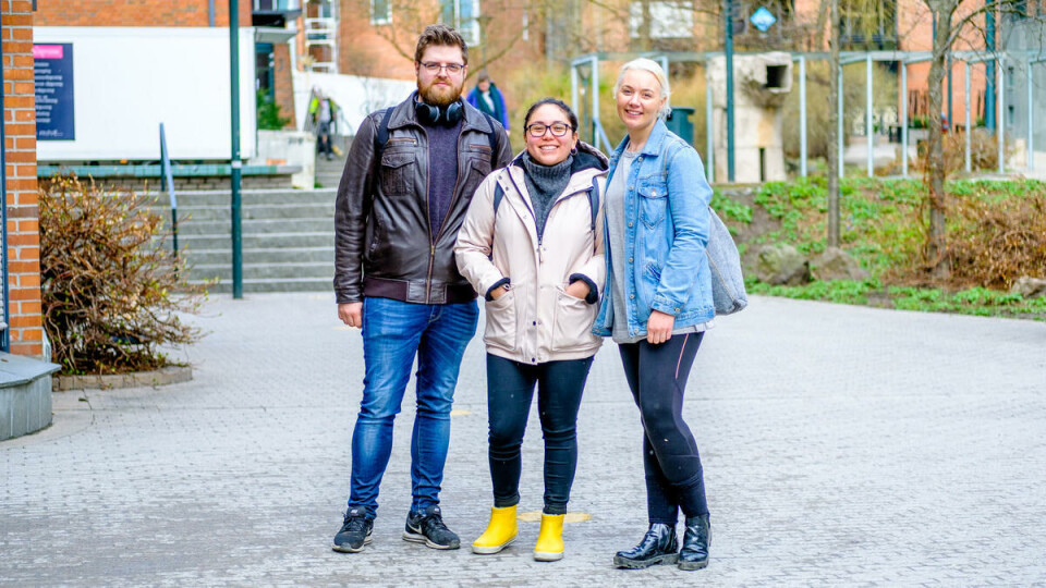
Others are less satisfied. Pedagogy students, Nathalie Greiner (21), Antonella Savalli (24) and Mats Kristiansen (24), think the new logo lacks imagination and that the old Oslo and Akershus University College logo was better.
«It's very impersonal and has no clear message,» says Greiner, while Savalli thinks logo looks like it says «Oslo Omet» rather than OsloMet.

Bad allocation of finances
Kristiansen personally finds it boring that the logo consists of text only and no illustration.
«There’s nothing memorable about it. UiO's logo is much better,» he said.
When the three students were asked about how much they think the university has used on the new visual profile, they guessed it definitely cost too much. They were still shocked when confronted with the sum, describing the expenditure as excessive and unnecessary.
«It's not money well-spent,» one said.


